One of the most important ways that sports franchises market themselves is via their logo. A good logo can make a team millions of dollars, and can reach icon status and transcend that team’s fanbase. Immediately coming to mind are the Yankees with the interlocking “NY”, the Dodgers with their own interlocking “LA”, the Lakers, the Celtics, and so on and so forth. All of those logos are iconic, and worn by people who don’t cheer for those teams or are even into sports. A good logo can rally a fanbase, make them proud. A bad one can become a huge source of embarrassment and make that team become the butt of everyone’s jokes.
For the sake of this article, let’s take a look at some of those, simply because it’s much more fun to laugh at stuff.
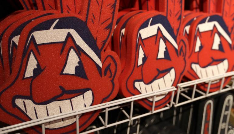
Washington Redskins/Cleveland Indians: Move On Already
These one make the list solely based on the racism aspect. It’s 2019, soon to be 2020, can we just start fresh by ending all the racist mascots and names? Whatever your ethnicity or nationality, think of the worst stereotypical epithet that someone can call you--now make that your favorite sports team’s name? Sucks, doesn’t it. That’s the Washington Redskins. And yes, Chief Wahoo is no longer the official mascot of the Cleveland Indians, but the image is still on tons of official merchandise. Just bad all around. Time to end it.
Cleveland Browns: Minimalism At It's Worst
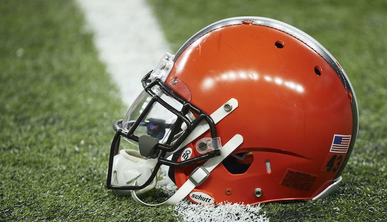
Staying in Cleveland for this one. Rumor has it that the team name stems from their first head coach, Paul Brown. That’s great, but how do you make a logo and mascot out of that? Apparently in Cleveland, you take a bland helmet that isn’t even brown (it’s orange), and you call that your logo. We guess it makes sense that nobody in charge seemingly cares since the Browns haven’t been relevant since the 1980’s. Go Oranges!
Tennessee Titans: Not Very Godly
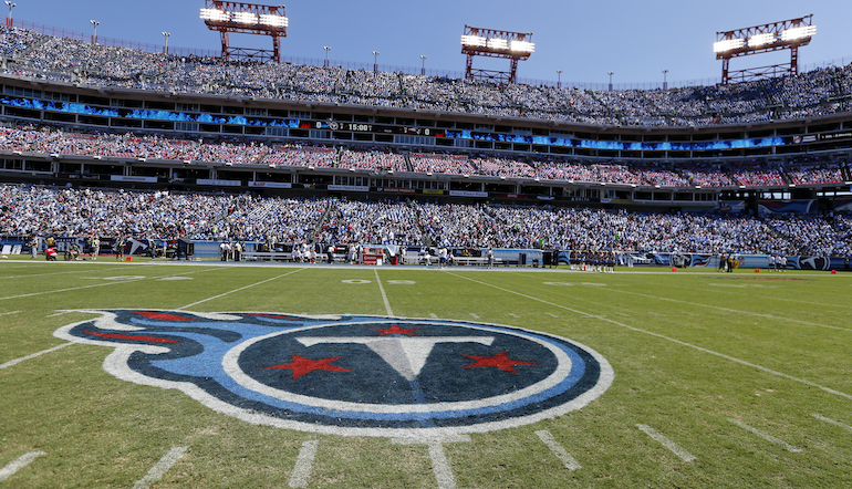
The Titans logo is a capital “T” inside of a blue circle with blue flames coming out of it. Huh? In Greek mythology, Titans were giants and ruled the earth,who gave birth to the gods,and only the Greek gods could defeat them. Much more than a “T”. We have no idea who was responsible for this absolutely awful logo, but they need to be held accountable. This logo would make much more sense if their mascot was the Meteors or Comets or something.
Brooklyn Nets: The Definition of Boring
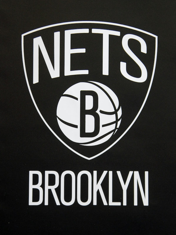
Next to the definition of “boring” in the dictionary, you will find this logo next to it. The logo is black and white and...that’s it. Basketball at its core is a game of improvisation, of flair, of artistry--the same can be said for a city like Brooklyn. Spike Lee and Biggie Smalls are two of Brooklyn’s native sons and improvisation and artistry oozed from their pores, and this is the best you can do? Throw the whole thing away and bring in some color, some style.
New England Patriots: We Miss Patriot Pat
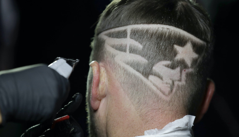
The Patriots logo is like if 1950’s Elvis Presley starred in a movie about the American Revolution. Back before the Patriots and their fans became insufferable, so, when they were aterrible franchise and not winning anything, their mascot was “Patriot Pat”, and he was cool. Just a regular guy fighting the Brits by day with some time to hike a football in between. Great logo and helmet combination. Then they dumped him for “the guy they told you not to worry about”. Nobody likes that guy.
Tampa Bay Rays: Get Your Innoculations
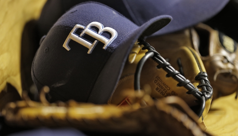
There are a few sports franchises with logos that are poor attempts to mimic the classy interlocking letters of the Yankees and Dodgers, but this one has to be the worst. When we see the letters “TB” in any form whatsoever, we think of tuberculosis, the infectious bacterial disease that can kill you if not treated properly. The Rays wear these letters on a hat. We can’t help but think “the Tuberculosis Rays”. It’s way past time to just put the sea creature they’re named after on the hat and call it a day.
Vegas Golden Knights: Not So Golden Logo

Hockey has several poor logos (Winnipeg, Phoenix, Dallas), but this one takes the cake. It looks like when you’re watching a formula ‘90s action movie and the protagonist goes to a hockey game but since the movie couldn’t afford to pay for the NHL license, one of the teams is called the Vegas Golden Knights and this is the logo they made for it.
There are so many current and former terrible sports logos but these are the ones that truly rise above the rest. Hopefully none of them are from your favorite team(s) and you have been spared the embarrassment of being on this list. Go Oranges!
No matter how bad your team's logo may be, you can always bet on them at Sportsbook NJ, and the Sportsbook NJ blog for more MLB betting tips and articles.
*Credit to the photos of this article belongs to Rick Osentoski/Associated Press, Joe Howell/Associated Press, Seth Wenig/Associated Press, John Locher/Associated Press, Chris O'Meara/Associated Press, Charles Krupa/Associated Press, Tony Dejak
